

About the project:
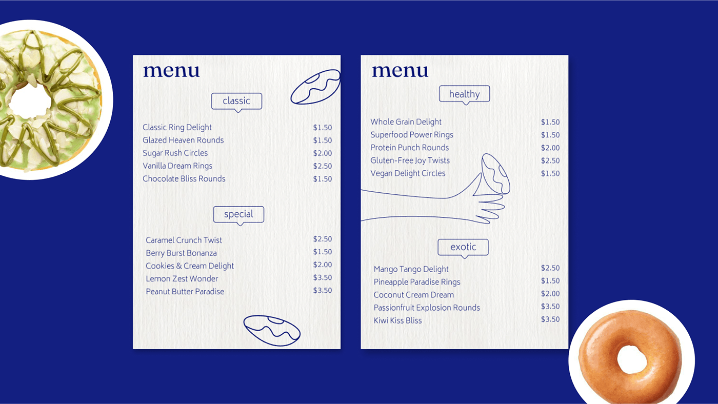
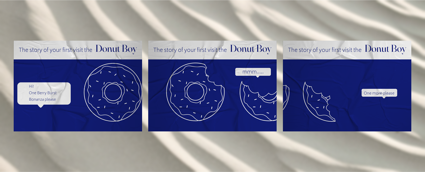
"Donut Boy" is a local network crafting donuts you won't find anywhere else in Las Vegas. The brand's uniqueness lies in its simplicity and complexity simultaneously, as their recipes consist of combinations of basic ingredients with added elements that are extraordinary and unexpected. There's always an element of intrigue about which donut you'll taste today...


Main Task:
Our primary goal was to develop an identity that encapsulates the essence of our establishment and communicates its distinctiveness. To achieve this, our client emphasized a preference for minimalism with strategic accents and unconventional pairings. As part of our startup strategy, we aimed to differentiate ourselves from competitors by departing from conventional glazed color schemes and positioning ourselves as an elite establishment with a clear concept.
Solution:
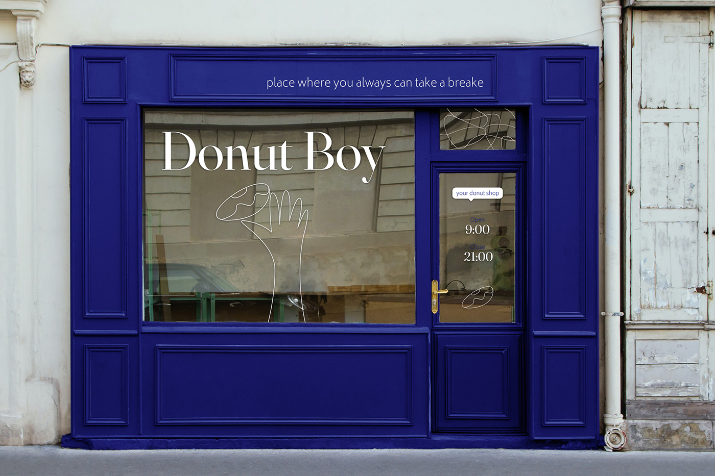
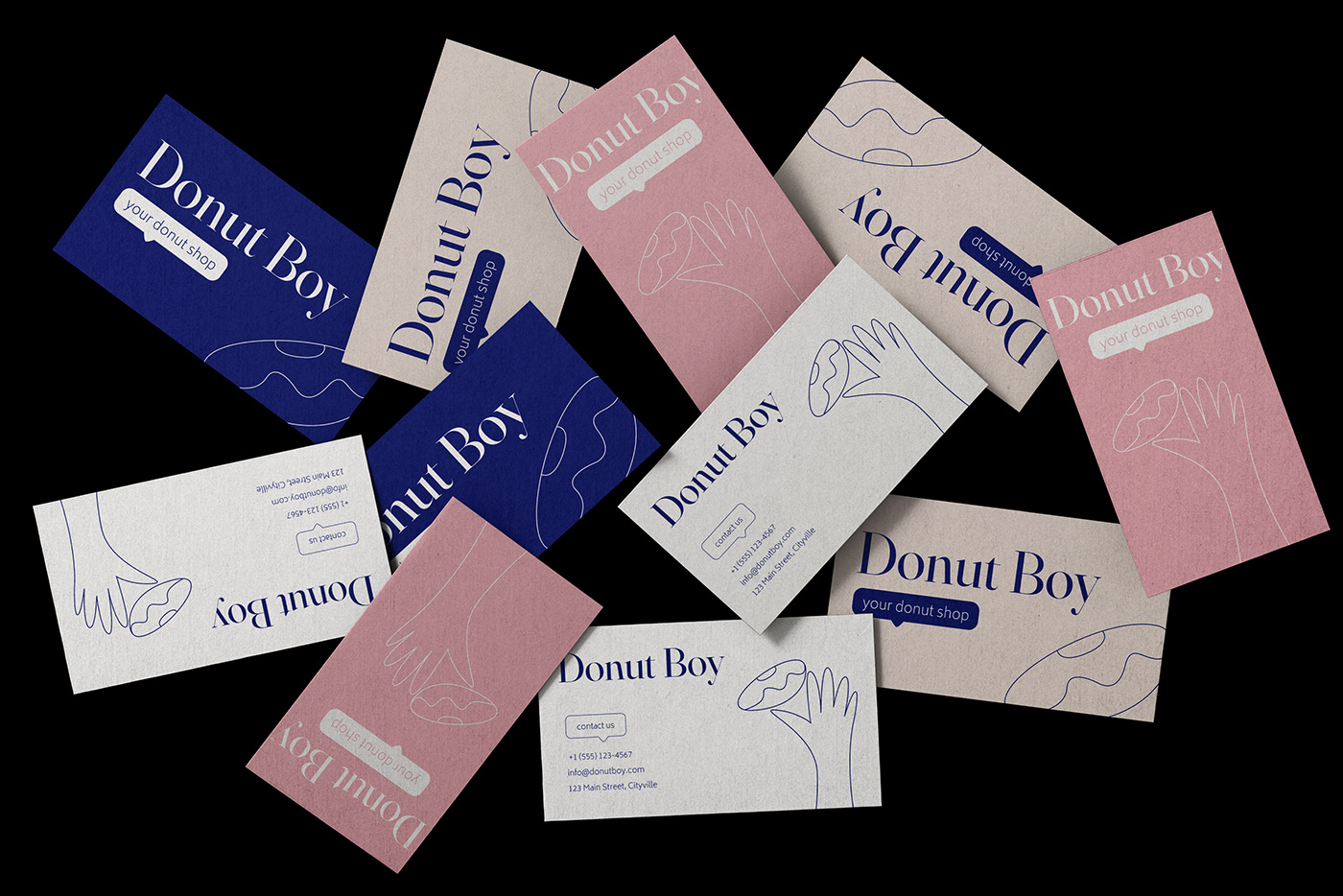
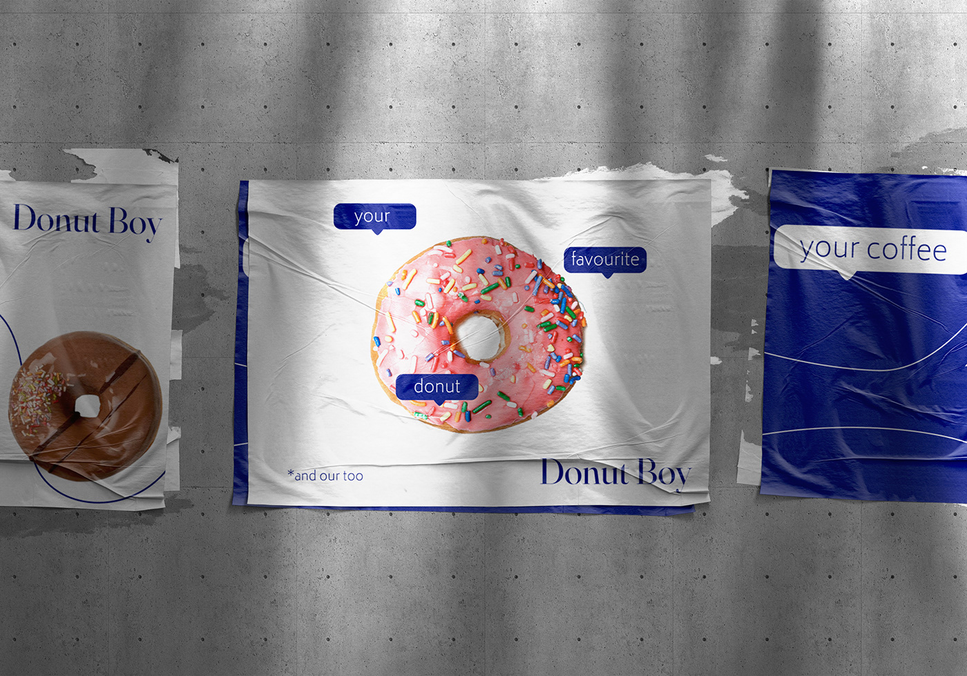
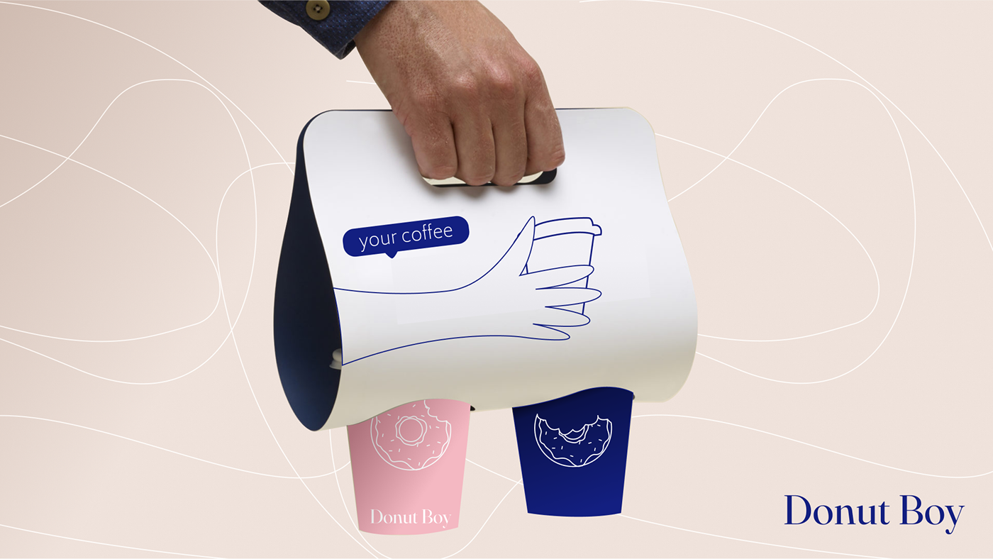
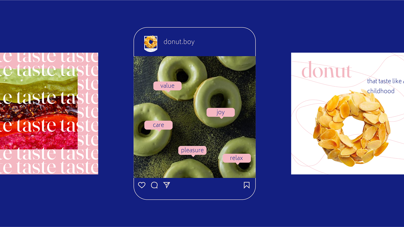
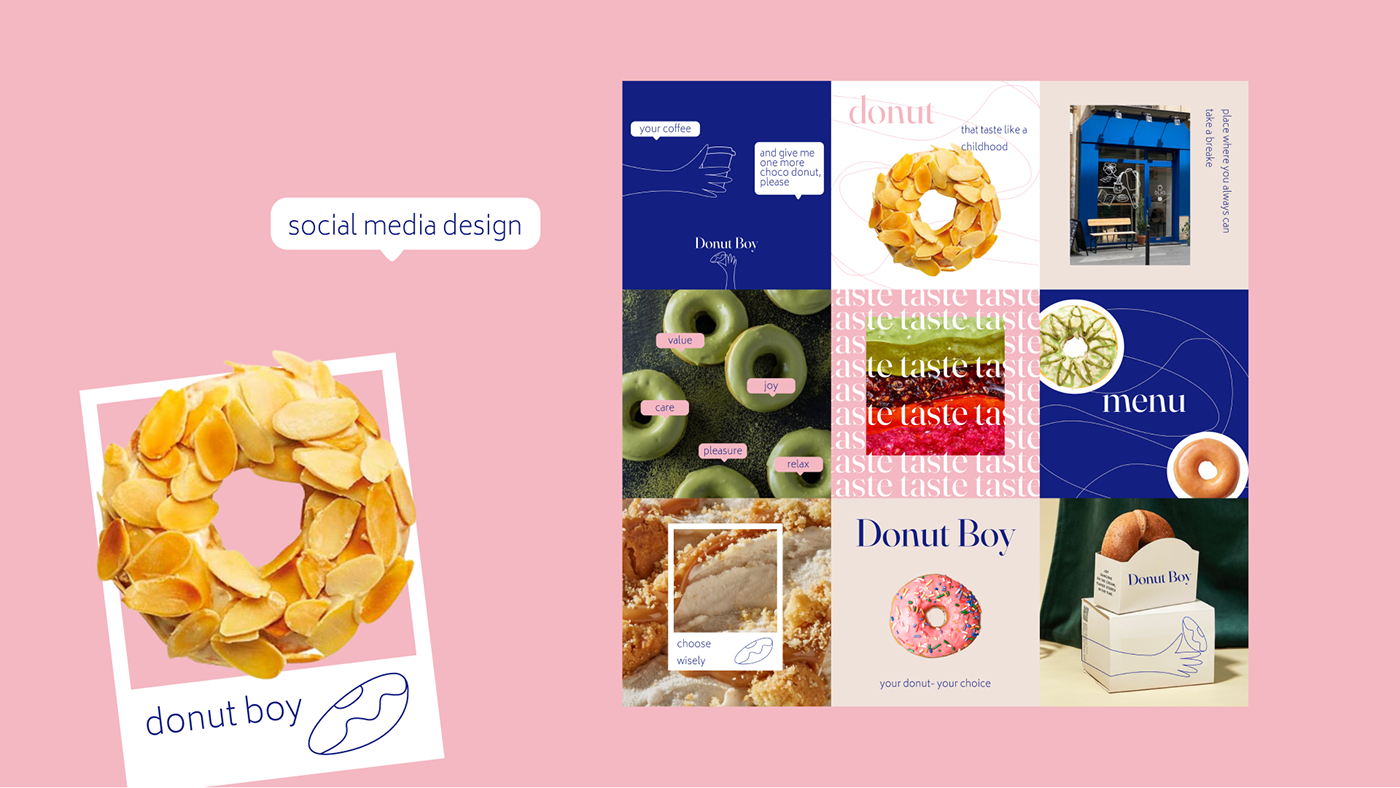
In crafting the logo and overarching identity, we drew inspiration from the refined aesthetics of French bakeries, a symbol of sophistication and enduring classicism. Hence, the logo was meticulously designed in a minimalist doodle style, while the font selection adhered to the principles of timeless elegance.
To enhance visual impact and contrast, we opted for complementary colors that reflect the diversity and multifaceted nature of our establishment. Our font choice was carefully curated to strike a balance and convey the underlying theme of "classicism" that underpins all our donut recipes.


Thanks for watching!
Design: Yulia Berezniak | berezaula2002@gmail.com


